The DocLock Interface
DocLock has a consistent layout on every screen: a left navigation sidebar, a top bar along the top, the main content area in the middle, and — on some screens — a right sidebar with extra context. Once you know these four regions, you can find your way around anywhere in the app.
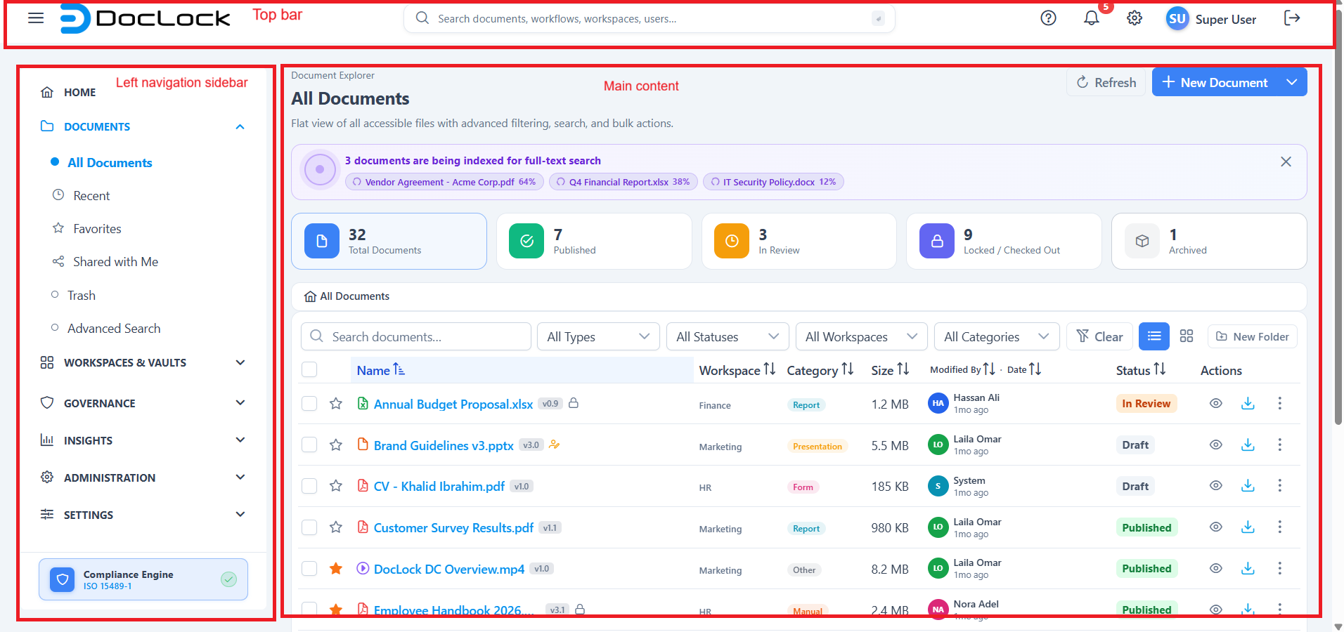
1. The left navigation sidebar
The sidebar on the left is your main way to move between areas of the app. It groups screens into expandable sections:
- Home — your personalized dashboard.
- Document Explorer — All Documents, Recent, Favorites, Shared with Me, Trash, and Advanced Search.
- Workspaces & Vaults — All Workspaces, My Workspaces (your individual workspaces), Personal Vault, and Official Records.
- Governance — legal holds, archive & retention, and audit logs.
- Reports — document activity, compliance, user activity, workspace storage, and audit trail.
- Administration — users & groups, roles, workspace role designer, workflows, templates, and attributes.
- System — general settings, integrations, license, help, and about.
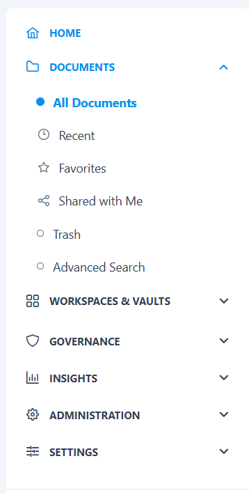
Note: The sidebar is permission-aware. You only see the sections your role allows, and the exact set of items adapts to your user type — so a knowledge worker's menu looks different from an administrator's.
Your My Workspaces list is built from the workspaces you actually have access to, so you can jump straight into a specific team area.
2. The top bar
Running across the top of the screen, the top bar gives you tools that are available everywhere:
- Global search box — type anything and press Enter to search across documents, workspaces, workflows, and people.
- Notification bell — shows a badge with your unread count; click it for a dropdown of recent tasks, replies, status changes, and system messages.
- Help (?) — opens a contextual help drawer with guidance relevant to the page you're on.
- Appearance / configuration — theme and layout controls for your view.
- Profile menu — your avatar opens a menu to reach your Profile and to sign out.

3. The main content area
The center of the screen is where the actual work happens — it changes with whatever page you've opened. Common patterns you'll see:
- List/grid pages (like All Workspaces or All Documents) with summary stats, filters, and cards or rows.
- Detail pages (like a single document) with tabs for versions, metadata, activity, and comments.
- Configuration pages (settings, roles, workflows) with tabbed forms and editors.
Most pages show a header with the page title, a short description, and the primary action buttons on the right.
4. Right sidebars (context panels)
Some screens add a collapsible right sidebar with information about what you're viewing. The best example is inside a workspace, where the right panel has tabs for:
- Activity — a live feed of recent actions (uploads, edits, approvals, comments, locks, shares).
- Pinned — quick links to important files you've pinned.
- Members — everyone with access and their workspace role.
Use the chevron button to collapse or expand the panel when you need more room.
Putting it together
A typical journey touches all four regions: you pick an area from the left sidebar, work in the main content, lean on the top bar to search or check notifications, and use the right sidebar for context like activity and members.
Tip: Lost? Click the DocLock logo (top-left) or Home to get back to your dashboard, and use the top-bar search to jump straight to anything by name.